A Glimpse of Time
Book Design, 2021Overview
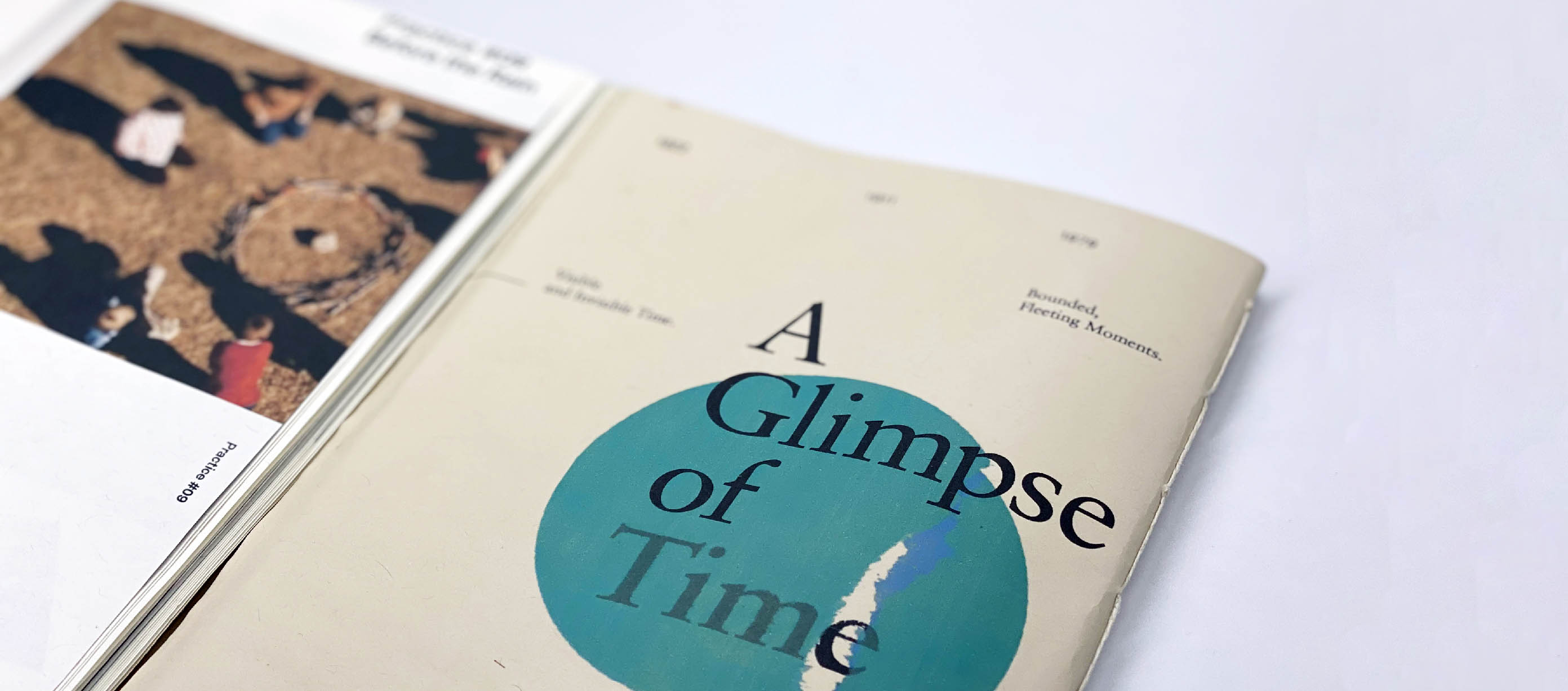
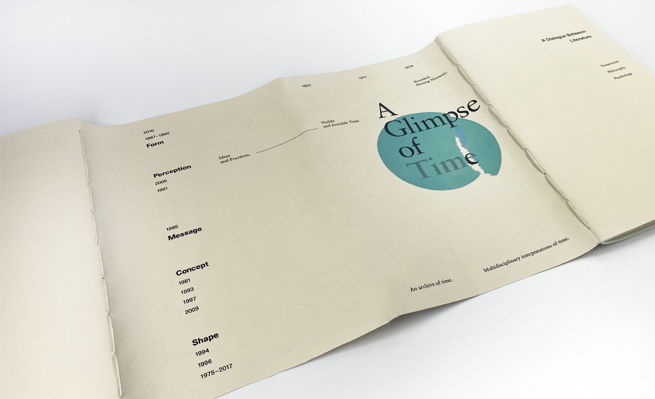
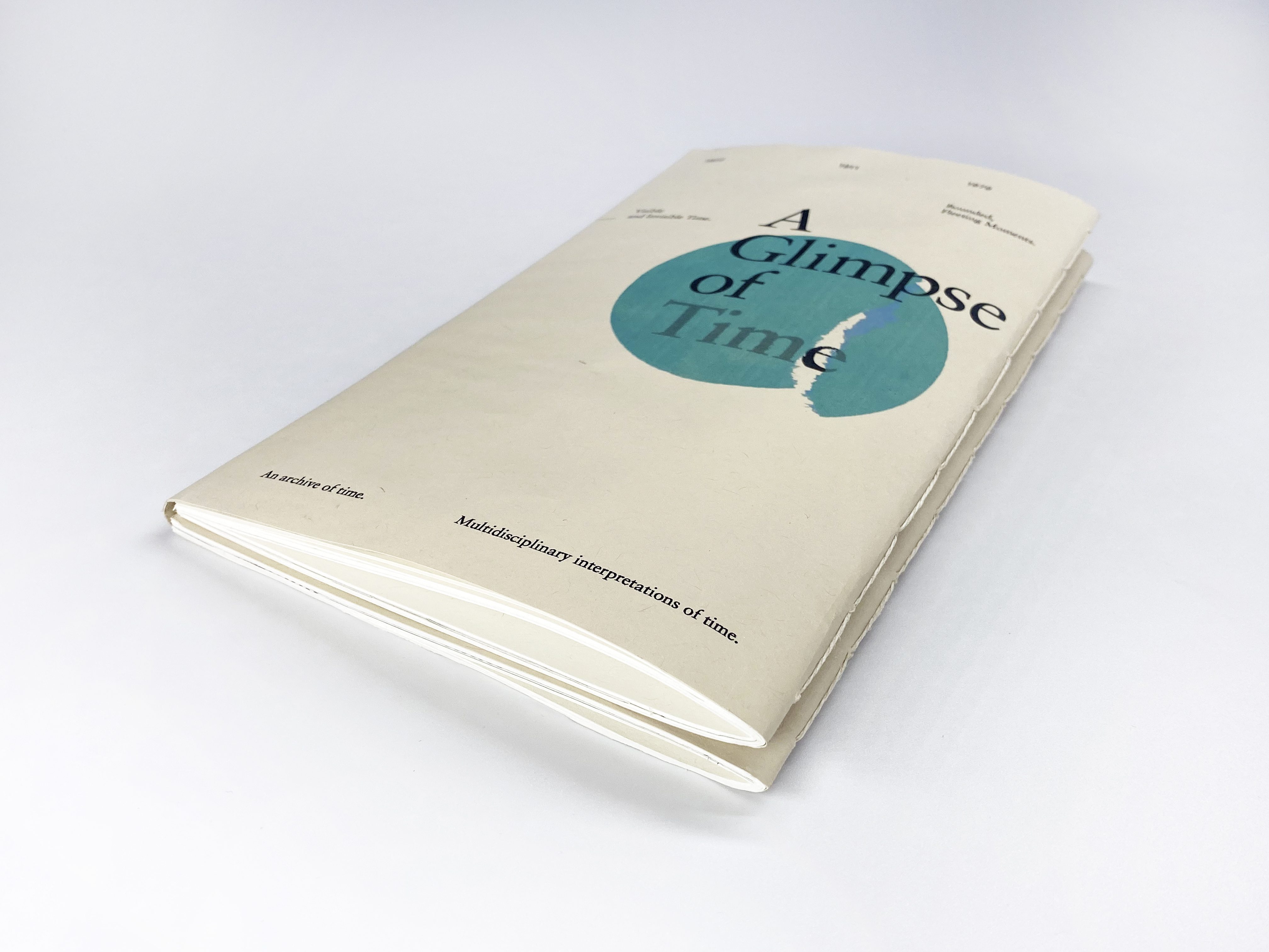
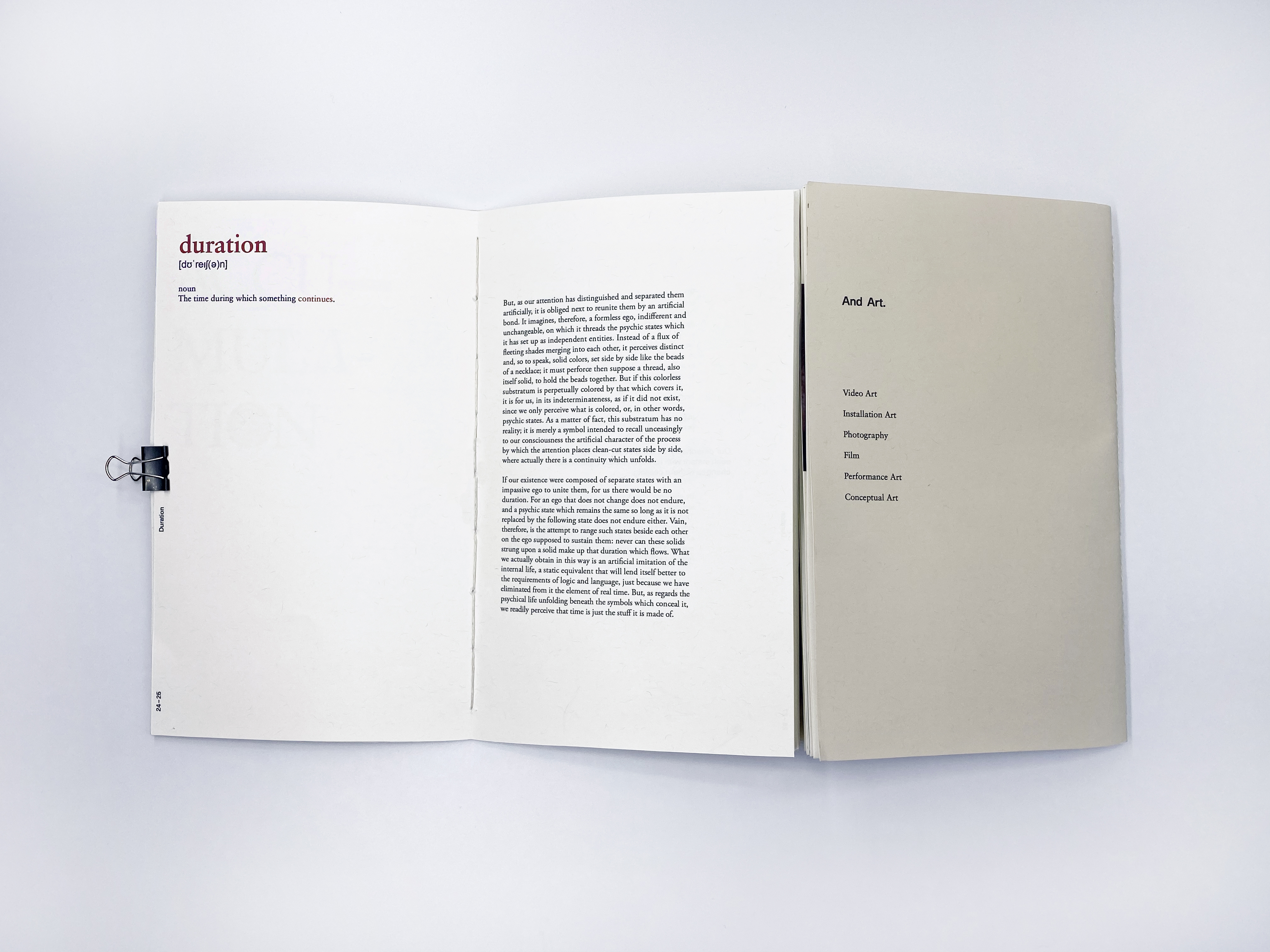
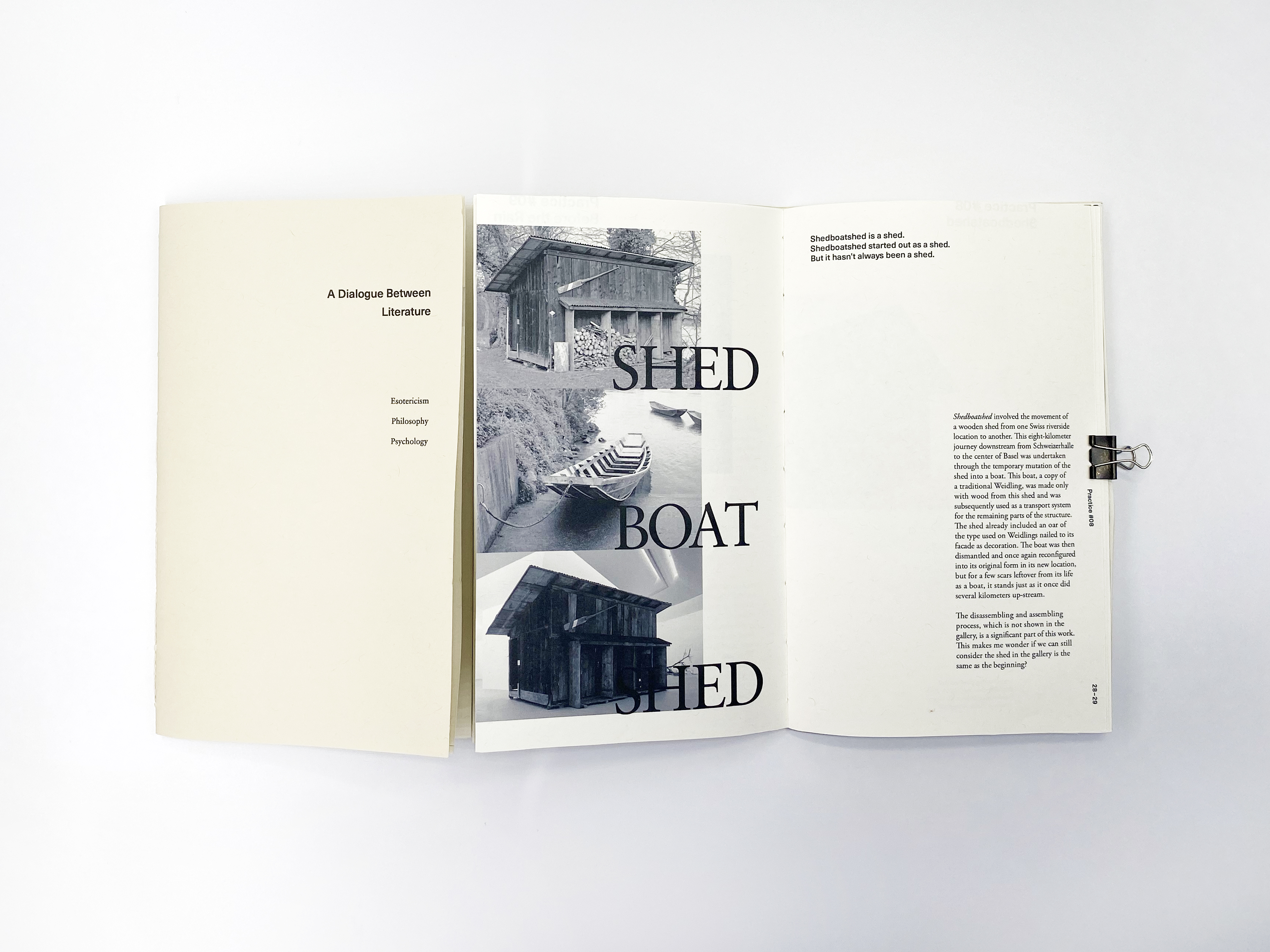
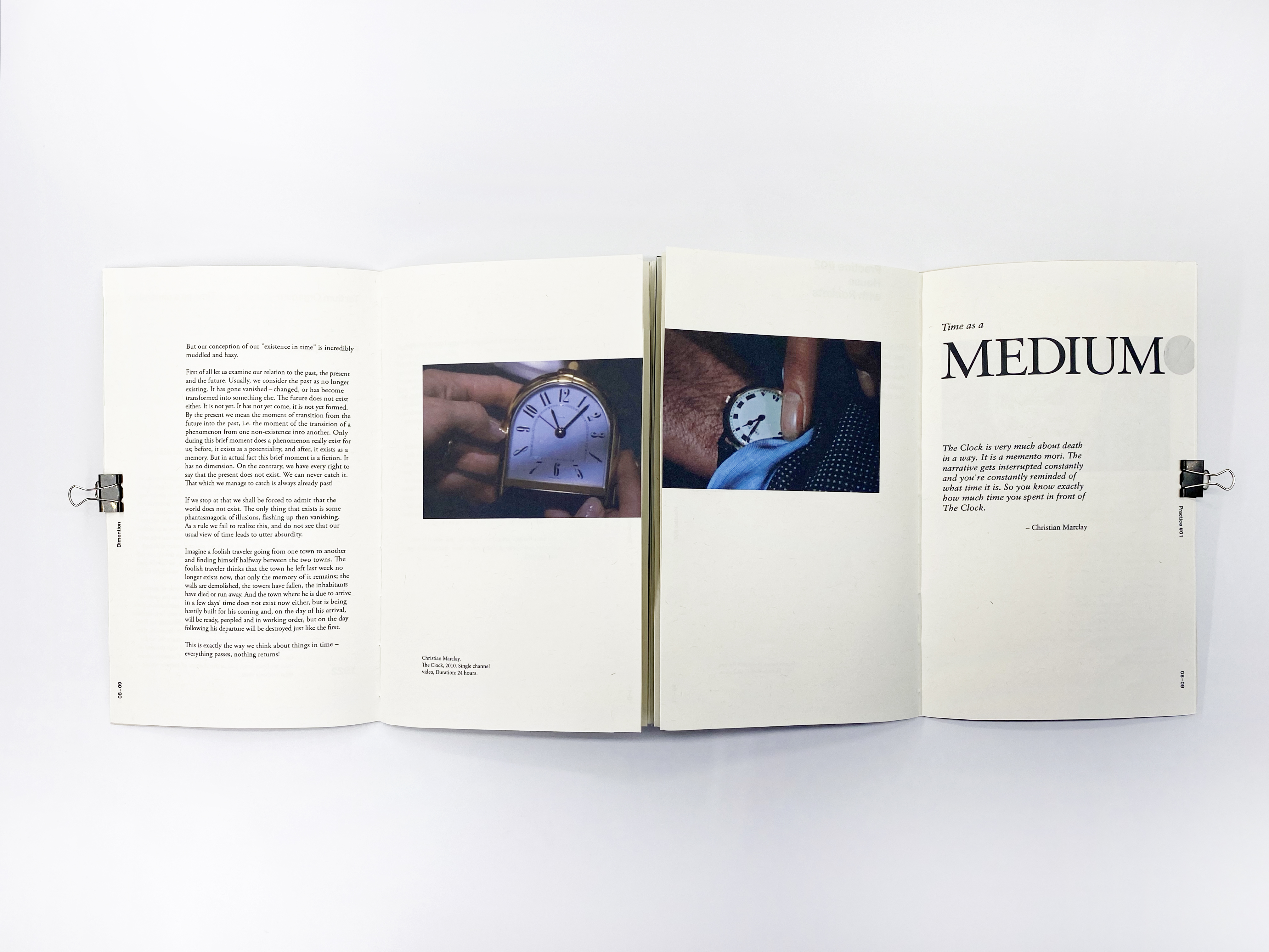
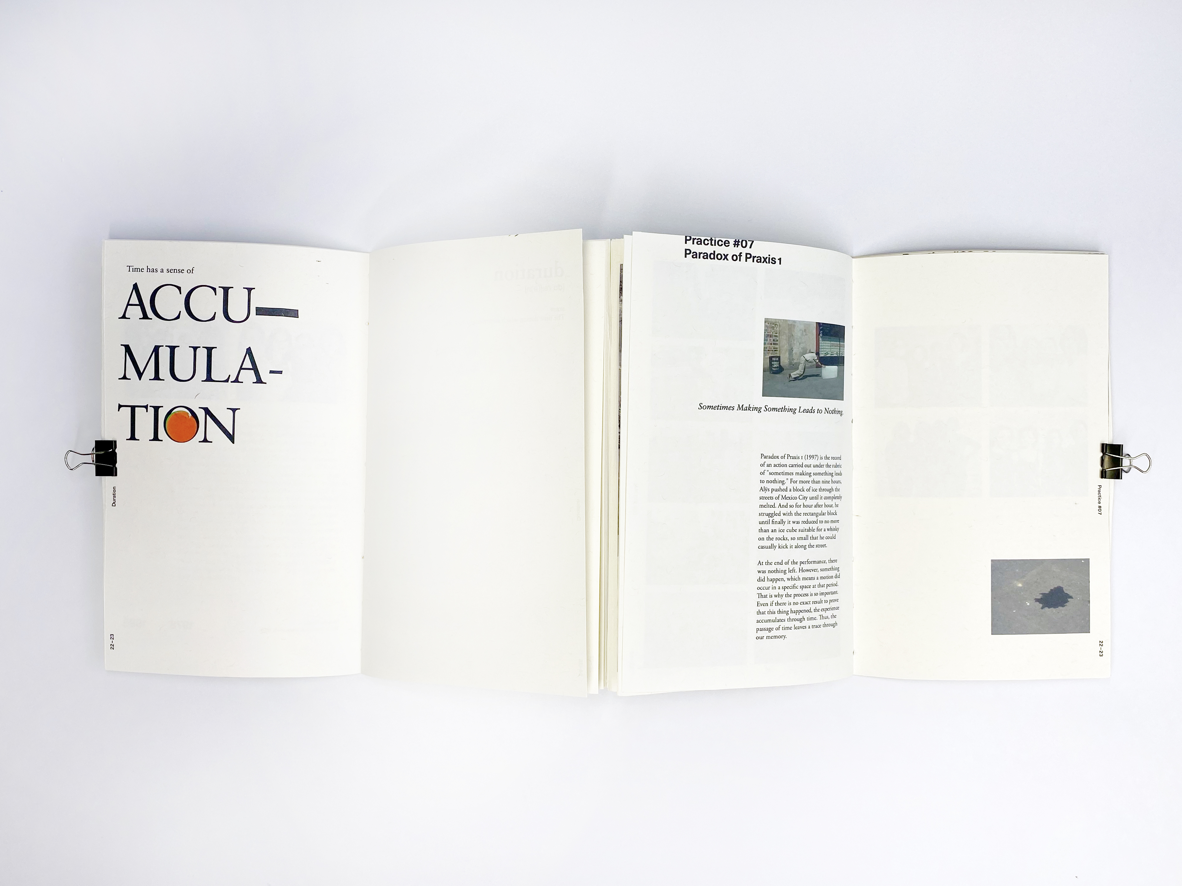
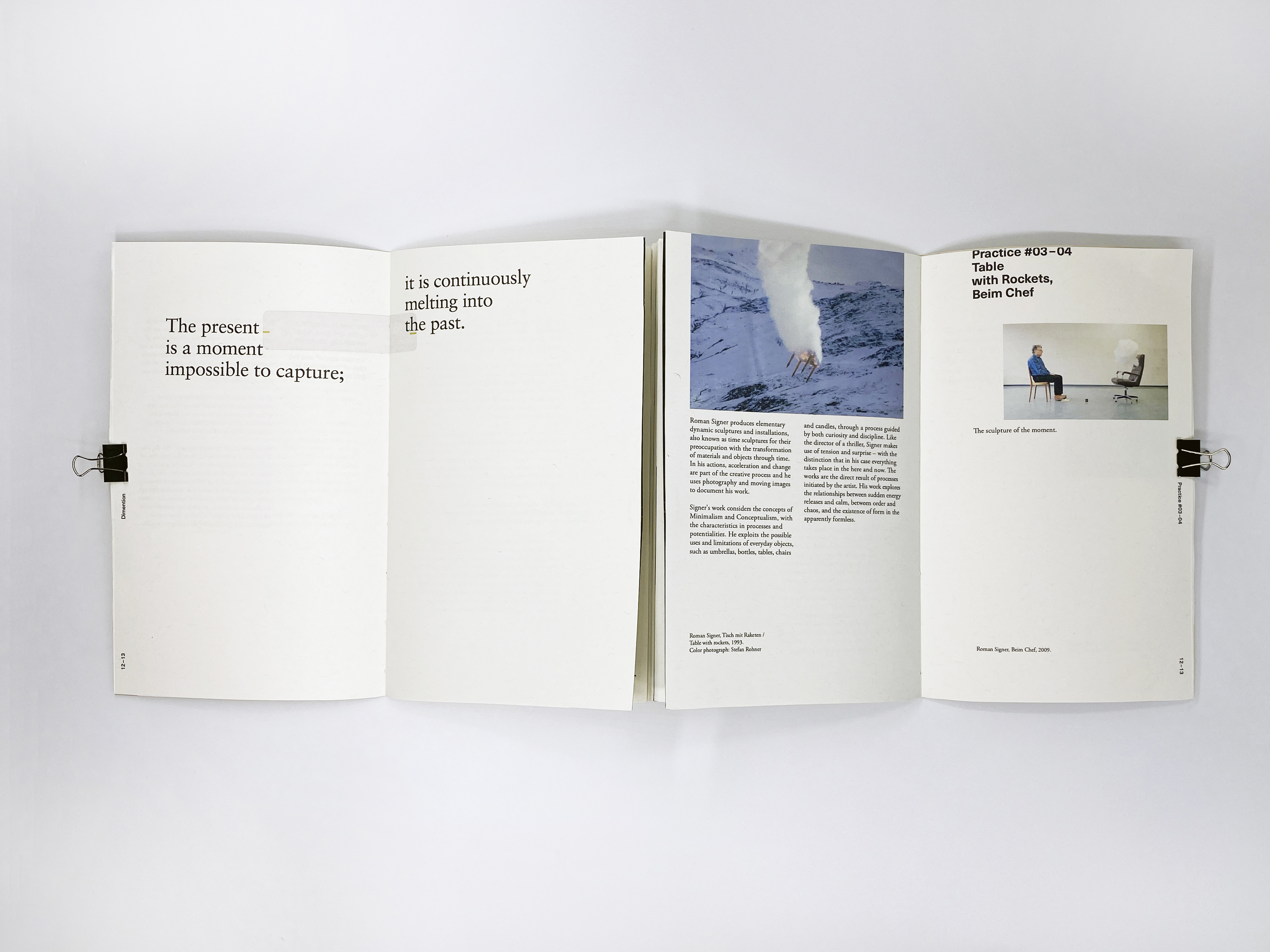
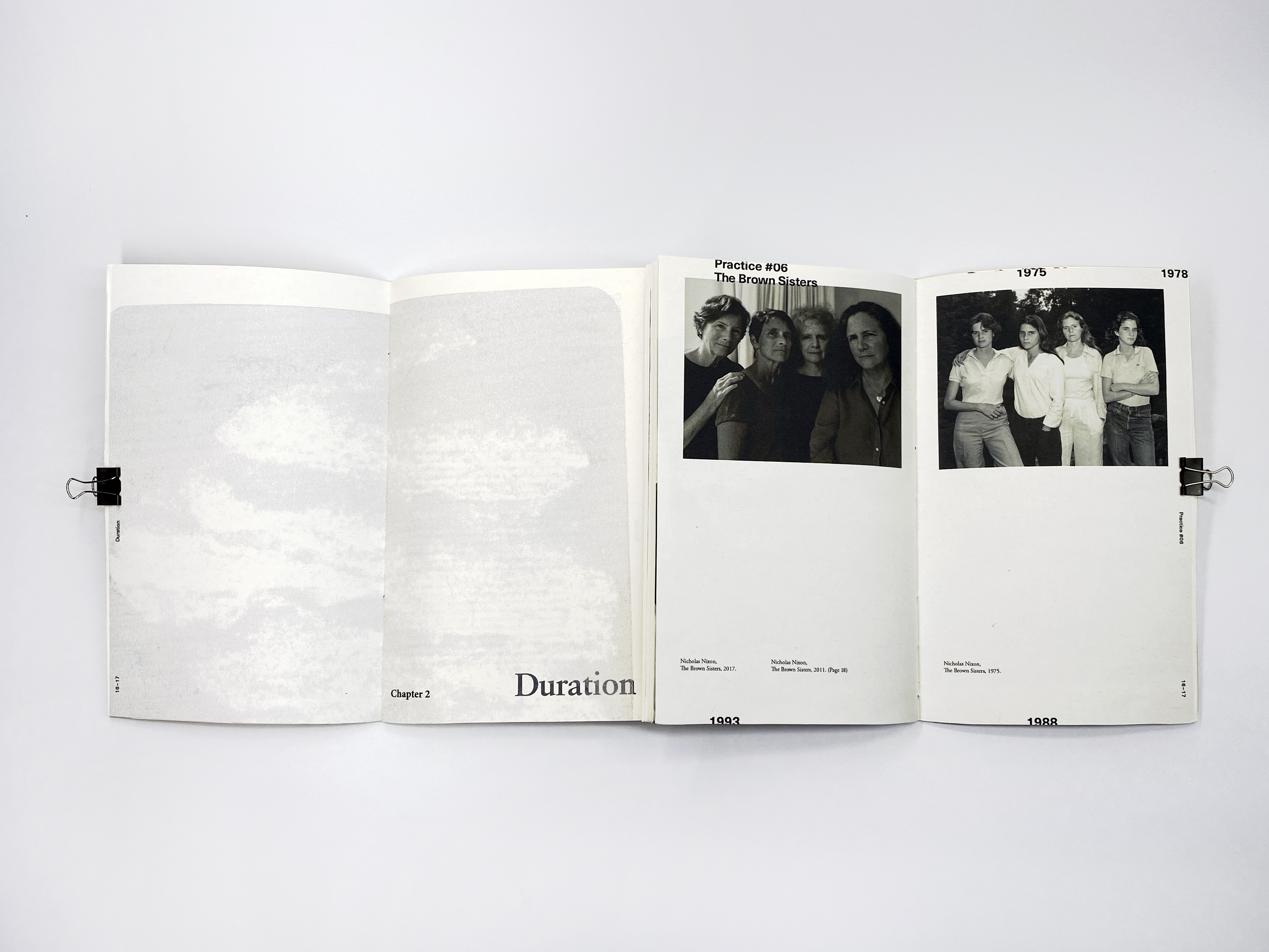
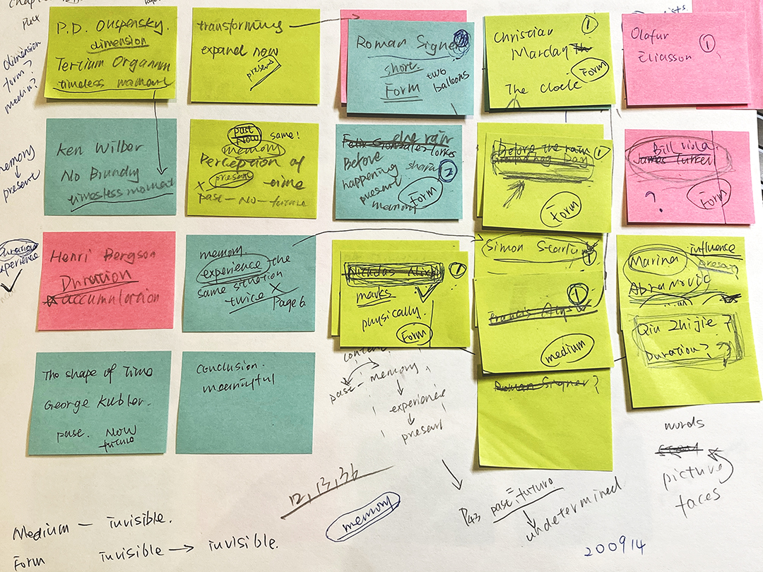
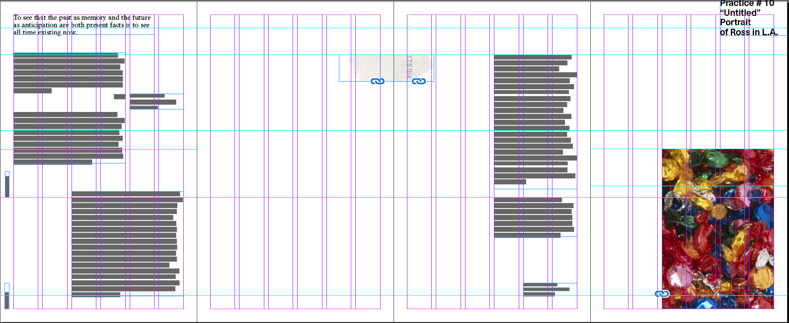
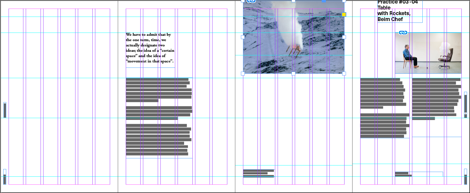
A Glimpse of Time uses visual language to discuss how these works of literature and artworks from different people are interlinked. This book includes text, images, texture, graphics, structure, typography, layout, prototyping, and production, with the visual language contextualized in the content.
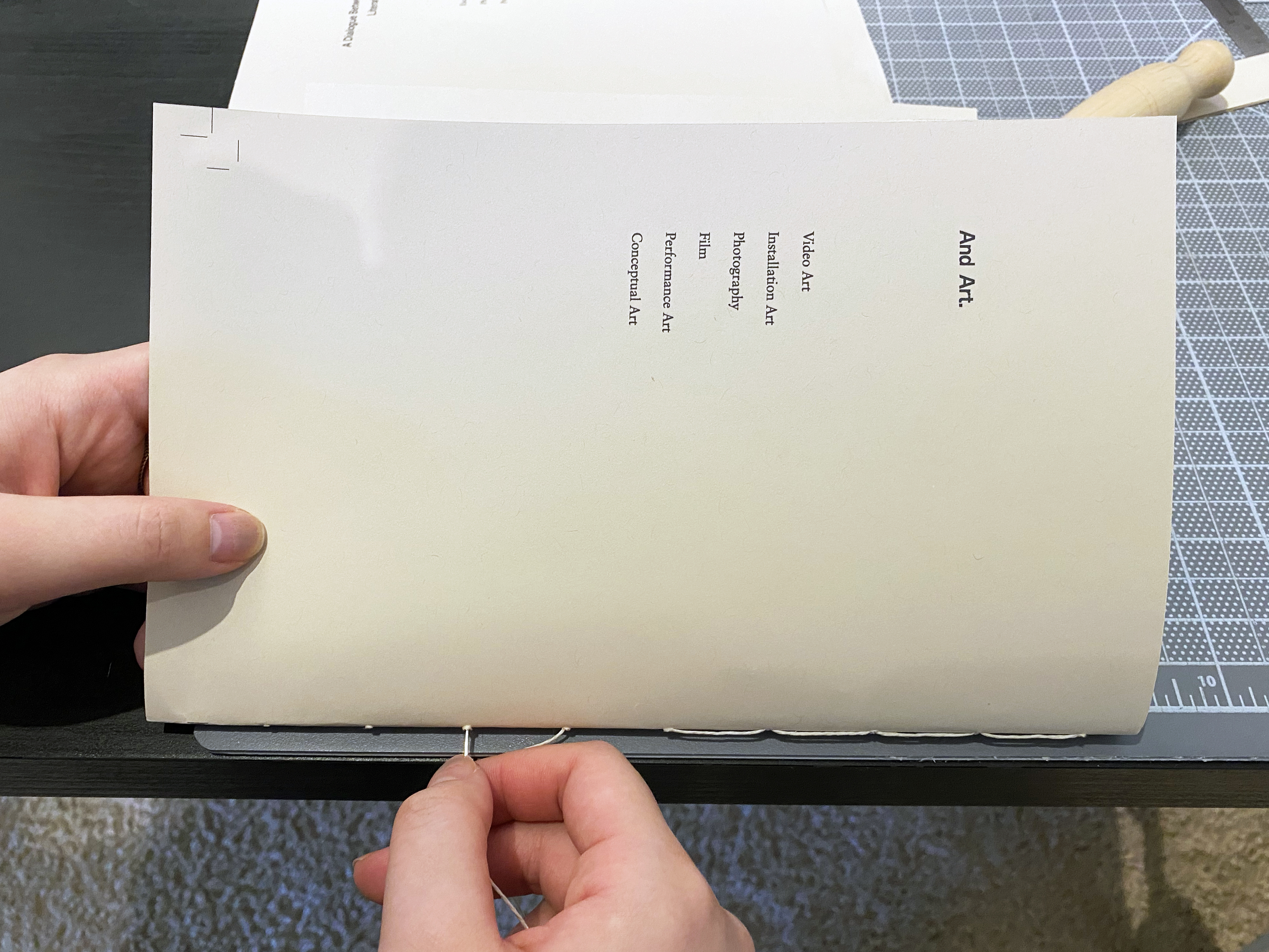
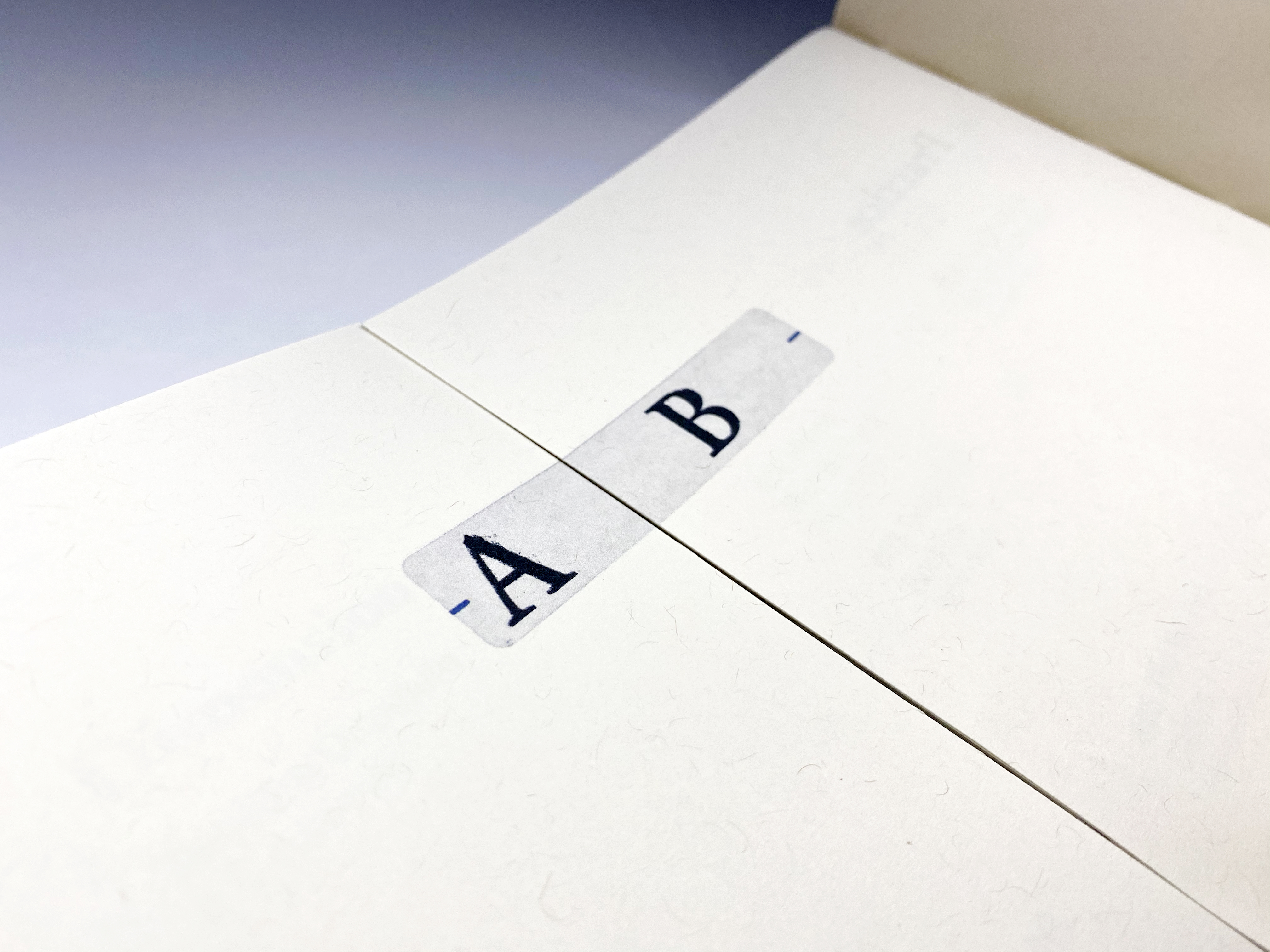
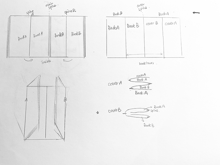
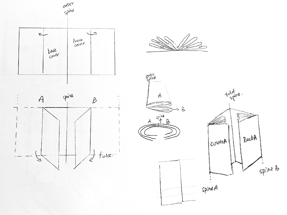
By assembling the information I gathered from my research of time, I decided to create a book of time to express my interpretation of time. According to the concept of “the present moment,” this book requires a certain sense of order, but at the same time has flexibility. I figured out the book’s final presentation is “two books that can be read simultaneously.” This book has two sections that are bound together on an extended cover. The challenge is that the two parts needed to be a finished book separately. Simultaneously, when they are read together, the two sections need to be integrated as a whole.
Goals
Develop a unique voice to
communicate a message effectively; explore how typography and editorial
strategies inform a narrative that is appropriate to the context. Expressively
design a book that the audience can relate to emotionally.
Typeface
Garamond, Sabon. Neue Haas Unica.
Color Palette
Black and white as the primary. Alternative colors are inspired by corresponding content and apply to that page.
Garamond, Sabon. Neue Haas Unica.
Color Palette
Black and white as the primary. Alternative colors are inspired by corresponding content and apply to that page.
Implementation

Ideation
Research
Design Process
![]()
![]()
Production

